
Russia’s new version of McDonald’s unveils logo
As it prepares to reopen its restaurants on Sunday, the Russian fast food chain that was formerly known as McDonald’s in the country has unveiled its new logo.
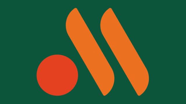
A circle and two lines appear in the new branding, which are said to represent a burger and two French fries. Although a number of options have reportedly been considered, the company has not yet revealed the name of the chain. McDonald’s announced in May that it would leave Russia due to the conflict in Ukraine.
According to Russian state-owned news agency TASS, which cited Sistema PBO, the firm that manages the business previously owned by McDonald’s, the Russian chain is set to reopen 15 restaurants this weekend.
“The logo’s green background represents the high quality of products and service that our guests have come to expect,” a Sistema PBO spokesperson told TASS.
The new logo, according to social media users, still looks like a “M.” Others speculated that the new logo was inspired by Bangladesh’s flag, which has a dark green background and a red circle in shades similar to the new logo. Sistema PBO has submitted eight potential names for the new chain to Rospatent, the Russian government agency in charge of intellectual property, according to the newspaper Izvestia.
“Tot Samyi,” which means “the same,” and “Svobodnaya Kassa,” which means “available cash register,” are among the names reportedly being considered. McDonald’s, Sistema PBO, and Rospatent did not respond to requests for comment from the BBC right away.
Picture Courtesy: google/images are subject to copyright